
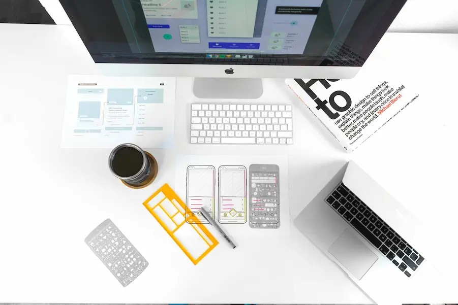
What is Mobile First Design?
Mobile-first design is, as the name implies, a design strategy in which web designers first look at the design for mobile devices. The focus is optimizing mobile phone UX (user experience). After that, you can move on to your desktop and tablet design.
This is in contrast to the more ‘traditional’ approach, responsive design. Responsive design first builds the desktop version of a website, whose layout then adjusts for smaller screens.
Prioritizing Content
On a small screen, you can retain more information. In mobile-first design, therefore, it is first well thought out which information has priority to show first. By thinking out the essential content first, you can display the important content to the visitor on any type of screen.
On mobile, unnecessary information, which would otherwise have been present in the design, is only later displayed or even entirely omitted.
Why Mobile First Design?
Serve the Increasing Number of Mobile Internet Users
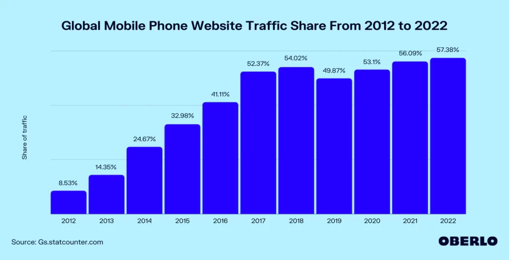
As early as 2016, mobile internet use became more prevalent than desktop internet use. Desktop. Currently, more than 57% of global web traffic comes from mobile devices. If most people simply visit a website via their phone, this must be a priority when designing your website.
Mobile First Indexing by Google
Google has also seen mobile web design become increasingly prevalent. Google thinks it’s so important that they now use “mobile-first indexing”.
This means that they primarily look at the mobile version of your website to index and evaluate it. The better your mobile web design, the better you are indexed. In doing so, they look primarily at the technical side of the website and the content displayed.
Mobile Friendliness
One way that Google then rated your website is mobile kindness. Things like a too-small font, buttons too close to each other, or a too-wide website for phone screens are markers used by Google to rank your website higher or lower in the search results. With this Google tool, you can see if your website is mobile-friendly.
Conversion Optimization
Using a “mobile-first design,” you must think about what the visitor wants to know or see about you. They will be more inclined to work with you when you can convey your message clearly and powerfully.
For example, on mobile design, you might leave off an atmospheric photo as a hero (large banner photo on top), so there is space to display your message right away.
While on the Desktop version, where there is plenty of space, you might decide to add a hero image. If you first built the desktop version, you are still displaying this photo on mobile and already taking up half the screen.
Showing a hero photo on mobile is not always a bad idea, but it depends on the visitor’s search attention.
For example, when someone is looking for a photographer, a picture says more than words. Therefore, prioritize first what information and content are essential for your visitors.
Is Mobile-First Design Always Necessary?
In my opinion, it depends a bit on the purpose and goal of your website.
For example, there are B2B industries where the design priority remains on the desktop screens because there is much information to share. In a case like this, a responsive design can be better.
Source:
- Gs.statcounter
- Oberlo
- Google Developers